live_tv
Livestream Starting Soon
00
Hours
:
00
Minutes
:
00
Seconds
Up next in 10

How to do crosstabs in JASP, how to figure out what it means, how to read the results a bit more easily by rounding the percentages... and why to do it!
Show More Show Less View Video Transcript
0:00
So here we are again and this time we're
0:02
going to do cross tabs or
0:04
crosstabulations
0:06
or as JASP and Jamovi call it
0:09
contingency tables and these are just
0:12
simple tables with statistics. So let's
0:15
take a look. I've already got here
0:17
loaded car sales database. This is a
0:20
sample database. I think it's actually
0:22
from SPSS
0:24
and we will uh we're already in
0:26
analysis. So, let's find the cross tabs.
0:30
You might think they're here in
0:31
descriptives, but they're not.
0:35
Instead, we find them under frequencies.
0:39
You go down and here they are for
0:40
contingency tables. And these are
0:44
really, really handy if you want to
0:45
explain stuff to people because not
0:49
everybody gets statistics, but you can
0:51
make it sound well. Let's show you.
0:55
Let's say that we're going to take
0:56
automakers as our columns. No, let's
1:00
make it rows. It'll be neater if it's
1:03
rows because they go down and you can
1:05
get it on one page. We'll take vehicle
1:08
type as the column. So, which one you do
1:12
doesn't really matter. It's just which
1:13
is easier to look at. If you put it in
1:16
reverse order,
1:18
then you see that it goes right off the
1:20
screen and it's hard to read. So, we'll
1:23
put it back here.
1:25
And keep in mind you can also do this
1:28
you see layers that's to add another
1:30
variable. So if you wanted to do this
1:32
within uh let's say that you wanted to
1:35
do
1:38
maker versus brand.
1:43
Then you can do this for automobiles and
1:45
then for trucks separately. So some
1:47
people would call that
1:48
three-dimensional.
1:50
Let's see. So, let's move brand out of
1:52
there and move type back up here.
1:56
And this is a very simple chart and it's
1:59
easy to see. It takes the makers of
2:02
various vehicles as in 1997 when I
2:05
believe this table is uh from and you
2:08
see that Chrysler made 14 things that
2:11
the EPA defined as automobiles which is
2:14
to say sedans and coups and convertibles
2:16
and that and 10 trucks which back then
2:20
did include minivans
2:22
and you can see GM made 33 cars and four
2:25
trucks Ford 18 and 8 and so on and you
2:28
can keep on going down. Uh Volkswagen,
2:31
this is so long ago. Volkswagen made 10
2:33
uh sorry, 12 car models and no trucks.
2:37
And yeah, I don't see Porsche there. I
2:40
was looking for them
2:42
here. And then your statistics at the
2:44
bottom. And this is a a kai square test
2:47
on this particular table. That's the
2:49
default. If we want to uh if there's a
2:53
reason for it, we can show the
2:54
likelihood ratio.
2:57
And that is needed when you're not
2:59
really fitting the kaiquare assumptions.
3:02
Very often you'll have very similar
3:04
results here under P. In this case the
3:07
likelihood ratio actually gives you a
3:09
much uh better. So you can see the
3:12
kaiquare test p is 0.03 03 which roughly
3:16
means that uh only 3% of of the time
3:22
would we expect to see a pattern that's
3:26
this different from randomly distributed
3:30
due solely to chance. So what this is
3:33
looking at is differences across the
3:34
entire table,
3:37
not one thing versus another. It just
3:39
tells you that the way that the table
3:42
came out is probably not due to random
3:45
chance. That these things are probably
3:48
in some ways interacting that the
3:50
automaker
3:52
different automakers have different uh
3:54
proportions of cars and trucks is really
3:56
all it's telling you in that language.
3:59
So the chances are rather that different
4:03
automakers had different ratios of cars
4:07
to trucks.
4:09
Basically that's what it's telling you.
4:10
Now you look at this and you try to
4:11
explain this to somebody and it's a
4:13
little hard, right? So we can do things
4:16
by going to cells
4:18
and we can put in percentages.
4:21
So let's do row percentage now says
4:24
percent within row. And what this is
4:26
telling you that among GM 89% of the car
4:31
name plates that they have are cars. 11%
4:35
are trucks. Rounding a little bit.
4:39
Uh for Ford. Actually, we can shut off
4:40
the rounding.
4:47
Let's see. We'll go to zero decimals
4:50
here and we'll go back. So, uh here you
4:53
can see. So now it's much easier to
4:55
read, right? So Ford 69% of their
4:58
vehicles were cars and Chrysler 58%
5:01
42% were trucks again including
5:04
minivans. So you see looking at this and
5:06
probably including Jeeps. So you see
5:09
looking at this you see that um of the
5:13
uh automakers here Toyota, Honda,
5:17
Chrysler had the highest percentage of
5:20
vehicles that they made being trucks.
5:22
The other way to do this is to show
5:26
columns.
5:28
So here you say that of the automobile
5:30
name plates available in the US, GM made
5:33
28% of them, Ford made 16%, Chrysler
5:36
made 12%.
5:38
That's basically what it's saying. So
5:41
what some people do is they put in row
5:44
and column. And this is a good way to
5:46
drive yourself crazy and to make
5:48
mistakes. It's not that hard to make to
5:50
do this differently. But the thing is,
5:54
if you're making a point, it's easier to
5:56
say it something like
5:59
uh Chrysler uh 42% of the vehicles
6:03
Chrysler sold were classified as trucks
6:06
compared to GM where 11% were classified
6:09
as trucks. You understand what that
6:12
means intuitively. It's easy to say.
6:15
Kaiquare is great for talking to
6:16
scientists
6:19
um but it's not great for talking to
6:22
other people.
6:24
Let's just do one more for illustration
6:34
and go to the general social survey
6:37
again. We go to frequencies
6:39
contingency tables and let's compare.
6:43
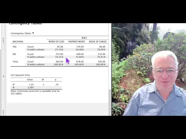
Let's do back pain.
6:45
Whether or not people have back pain
6:49
with their belief in what the Bible
6:51
really is. So here you can see we'll go
6:55
to cells and we'll put in the
6:56
percentages.
6:59
What is this 25%.
7:02
What is this 25% over here?
7:06
It is the percentage
7:09
of people who have back pain
7:13
who believe that the Bible is the word
7:15
of God. So of people who have back pain,
7:17
48% believe the Bible is the inspired
7:20
word of God. 26% believe it's a book of
7:23
fables. Now if you look at these
7:25
differences, they're very, very small.
7:28
You would almost think that having back
7:30
pain does not influence
7:32
what you think of the Bible. So, let's
7:35
take a look. We'll go back to
7:38
preferences and we'll turn the uh
7:43
turn the percentages back on.
7:47
And we see P is 74. So, actually
7:51
statistically what this table is telling
7:53
us is that these things are arranged
7:56
about as we'd expect them if it was just
7:59
random chance.
8:01
But if that wasn't the case, it was a
8:03
big difference, then it would still be
8:05
handy to know the percentages. And again
8:08
we can go to cells we switch to column
8:11
and here you see that of those who
8:14
believe that the Bible is the word of
8:15
God
8:17
26% had back pain and 74% didn't
8:23
which is the same as the numbers for
8:25
people believe that the Bible is the
8:26
inspired word of God
8:29
and is actually pretty close to people
8:30
believe that the Bible is a book of
8:32
fables.
8:34
So there you have it. That's basically
8:36
contingency tables. Uh you can usually
8:39
ignore the values of the kiquare and for
8:43
that matter if you're showing that if
8:44
you're using the likelihood ratio
8:46
instead you can ignore that value
8:48
because these numbers are computed with
8:51
the degrees of freedom. So you can look
8:53
them up in the table and find out what
8:55
the level p is. The computer does that
8:58
for you. So you just need really this
9:00
one column and you need to know how many
9:03
were involved so that you know that
9:05
you've got at least uh five cases per
9:08
cell which you obviously do. All right,
9:11
that's it. Let's move on to something
9:14
else.
#Statistics
#Statistics